island bay, wellington, new zealand
Every designers ideal project - working on their own house!
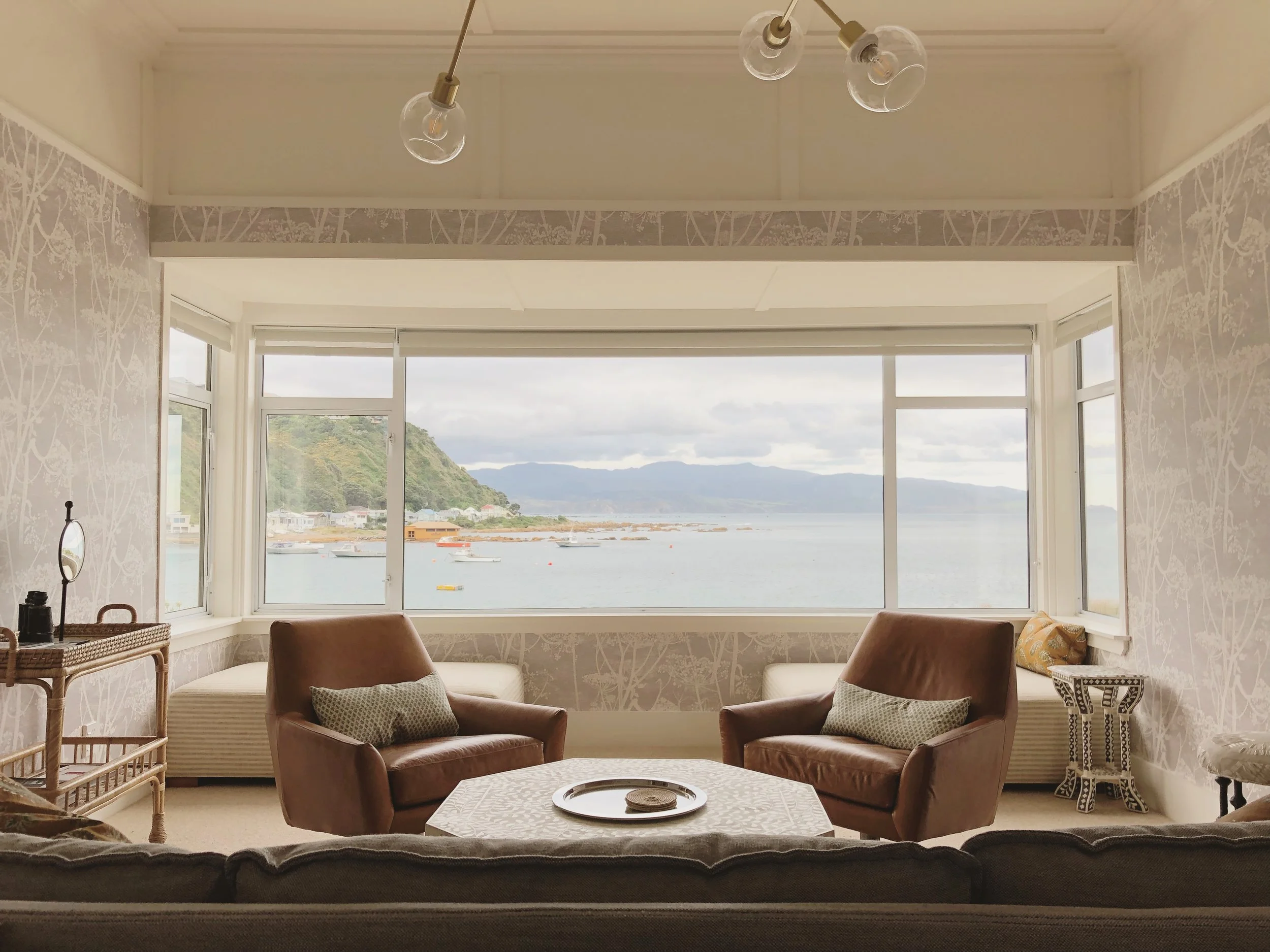
In late 2016 we were able to purchase my grandmothers seaside cottage after she had passed away. The house enjoys unobstructed views of charming Island Bay, in Wellington, NZ, complete with colorful fishing boats, stunning skies and an uninhabited island. The house has front row seats to the dramatic and rugged southern coast, with view across the bay to the harbor entrance and headlands.
My great uncle bought the house in 1951 after returning as a POW from WW2. My mother spent her childhood weekends there with her beloved grandparents & uncle - her granddad was a Scottish sea captain so it was a prime spot for them to keep an eye on the boats. I grew up not far from the property, and both my grandma and great uncle Jack would tell me their stories as young Scottish immigrants in Island Bay. Our motivation for purchasing the house was purely sentimental - I wanted to be able to pass on my deep sense of family connection to my children.
When we acquired the house, it had been well maintained but had endured a few unsympathetic remodels. My mum turned out to be a great resource as she could remember what the house had been like in its earlier years. Built in 1916 and looking outwardly craftsman-ish, the interior carried over Victorian proportions with high ceilings, a long central hallway and a warren of rooms. During mid-century remodels, previous inhabitants lowered the 9ft (3m) ceilings and removed all the original windows, doors and moldings, replacing them with ill-suited mid century style iterations. I love mid-century design but that was not suited to this house.
Renovating my goal was to sympathetically reinstate character, re-organize the space to work for how we live today, and infuse the house with lightness and fun. I also had to do this on a very strict budget without sacrificing quality materials and workmanship. Easy peasy right?
First thing - rip out the false ceilings and bring back the glorious high stud. The house has a small footprint, so having a bit of volume up top did wonders for gaining a sense of spaciousness. .
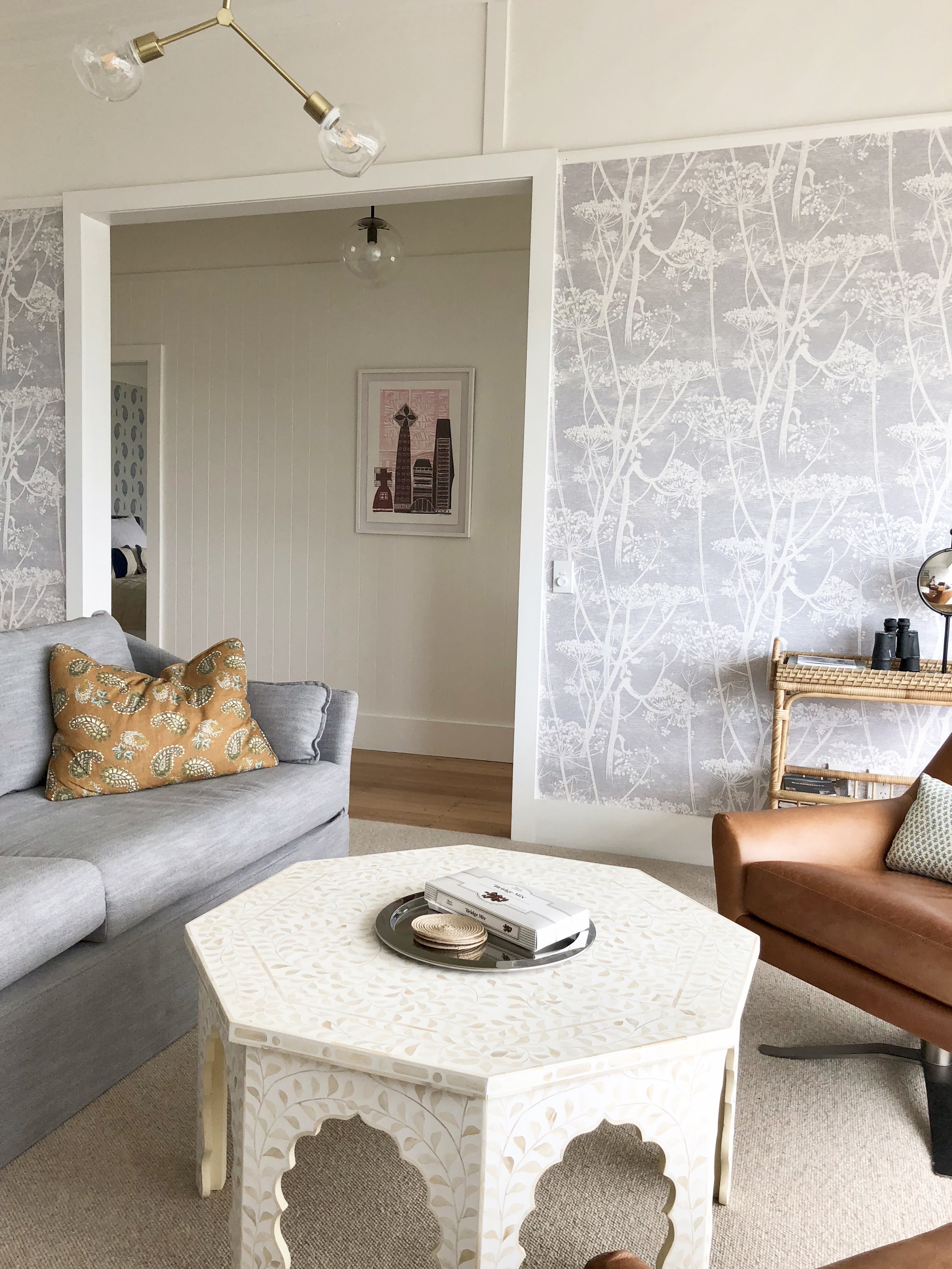
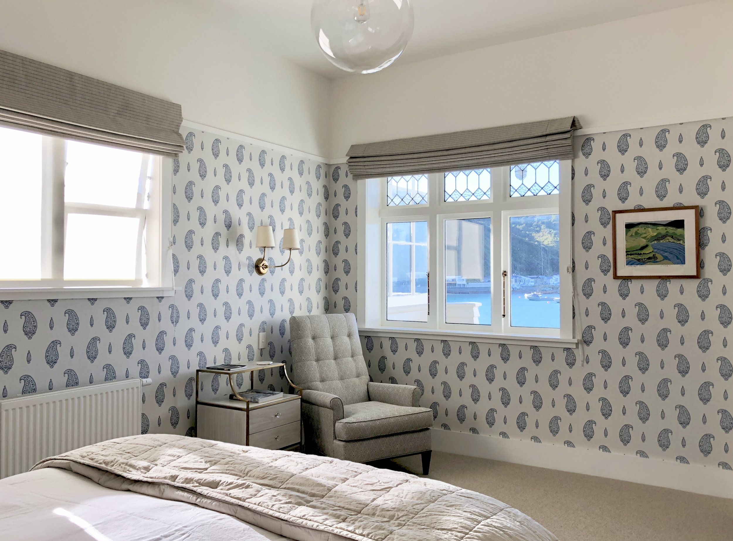
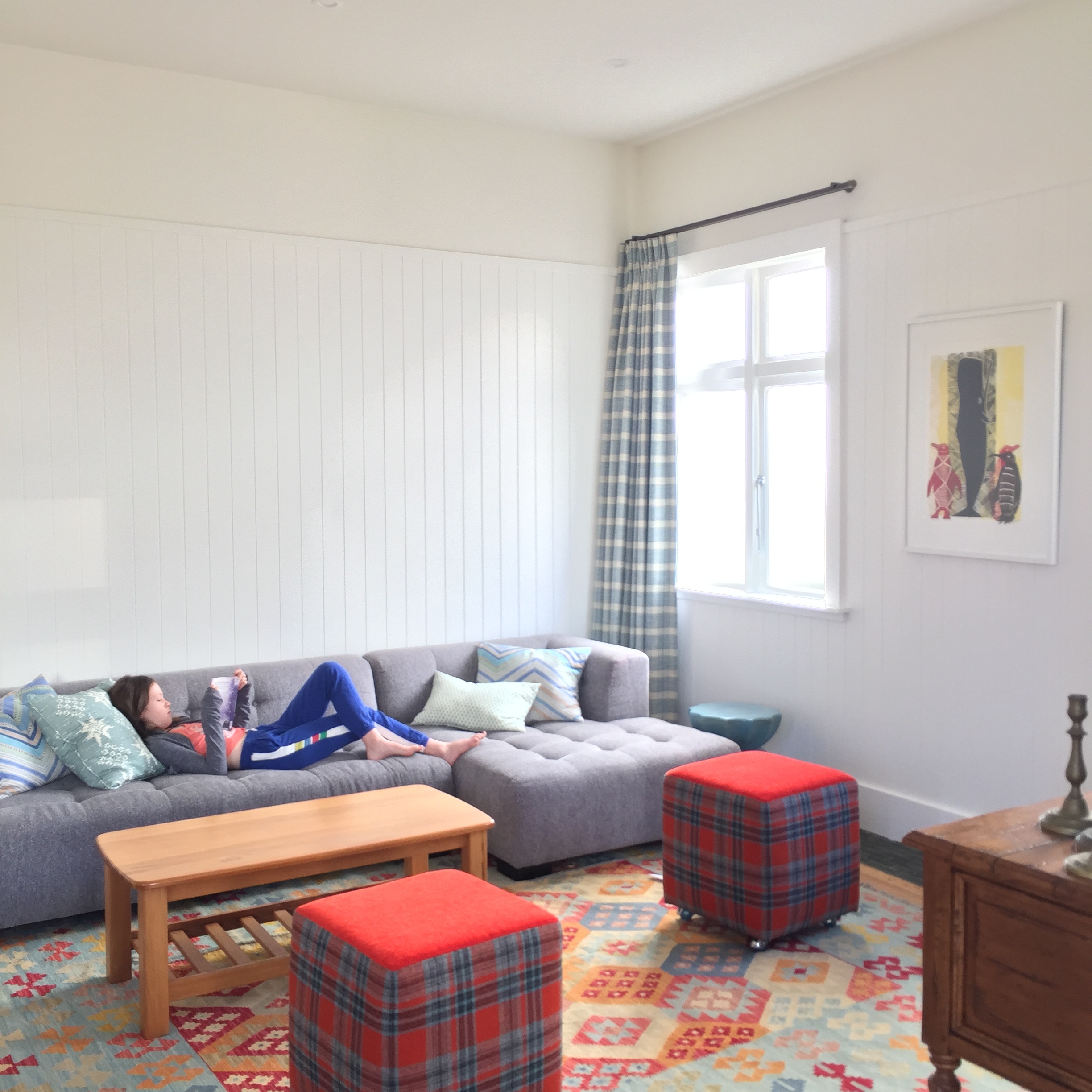
Originally the house had 2 large & 1 small bedrooms and a bathroom at the end of the hall. The bathroom was in a clunky spot where a view to the backyard should have been, so I chose to relocate the bathroom to the small bedroom. This meant losing a bedroom, but it opened up the area to become the dining space and we achieved a visual connection from the front of house to the rear garden. We rehabilitated the structure by stripping the interior walls back to the studs and upgraded all the utilities. The budget splurge was my decision to line the walls up to the dado (6ft high) with tongue & groove panelling. The T&G flows from the front entry, down the hall and into the family & dining area, and these communal spaces are painted in a crisp warm white. The rhythm of the tongue and groove texture draws you into the house, and the majority white spaces are a quiet contrast to the pattern & color in the bedrooms, living room and furnishings.
design challenge : it needs to appeal as a luxe vacation rental also
FURNISHINGS: Being in the design game for a while I had collected and/or ended up with a number of furniture pieces that were languishing in storage. Taking inventory of the locker became my starting point in the furnishings selection - my goal was to use whatever I could get away with without completely sacrificing the design intent.
New budget friendly retail items were found to fill in the gaps where needed - such as sofa & swivel chairs from West Elm, bed frames from Land of Nod for the kids room, and dining chairs from Serena & Lily. I made the choice to allocate funds to go with high quality custom items where crucial for design cohesion (ie: a custom head board, throw pillows & bench seats). I knew that it would be these elements that would end up being a pivotal aesthetic point of difference from a typical vacation home and that they would infer a sense of luxury.
During my travels I had collected a number of artworks on paper that I was able to finally find a home for. The majority were by New Zealand artists, so it was fitting that they are back in NZ showcasing kiwi talent to our overseas guests.
REGRETS/FURTHER PLANS: I don’t think I am a atypical designer to already be thinking of the next changes I want to make. The living room was one of two spaces that received little change or alteration. This space was simply repainted, re-wallpapered, and re-carpeted and it is the one space that I am least satisfied with. I’d like it to feel pared back and clean, to have less going on than it has now and be furnished with relaxed contemporary pieces. The old c.1950’s fireplace no longer functions and needs removing, and I’d like to see the walls paneled instead of papered. I need to replace the existing aluminum front windows with wood and install wooden floors. However the exterior needs painting, and the kitchen will need redoing next, and maybe we should add an upstairs for a couple of kids bedrooms so they don’t have to share, and the backyard could do with a deck. It might just have to be ok as it is - for the time being.


